The Ask: How do you launch the world’s largest display in the heart of Times Square?
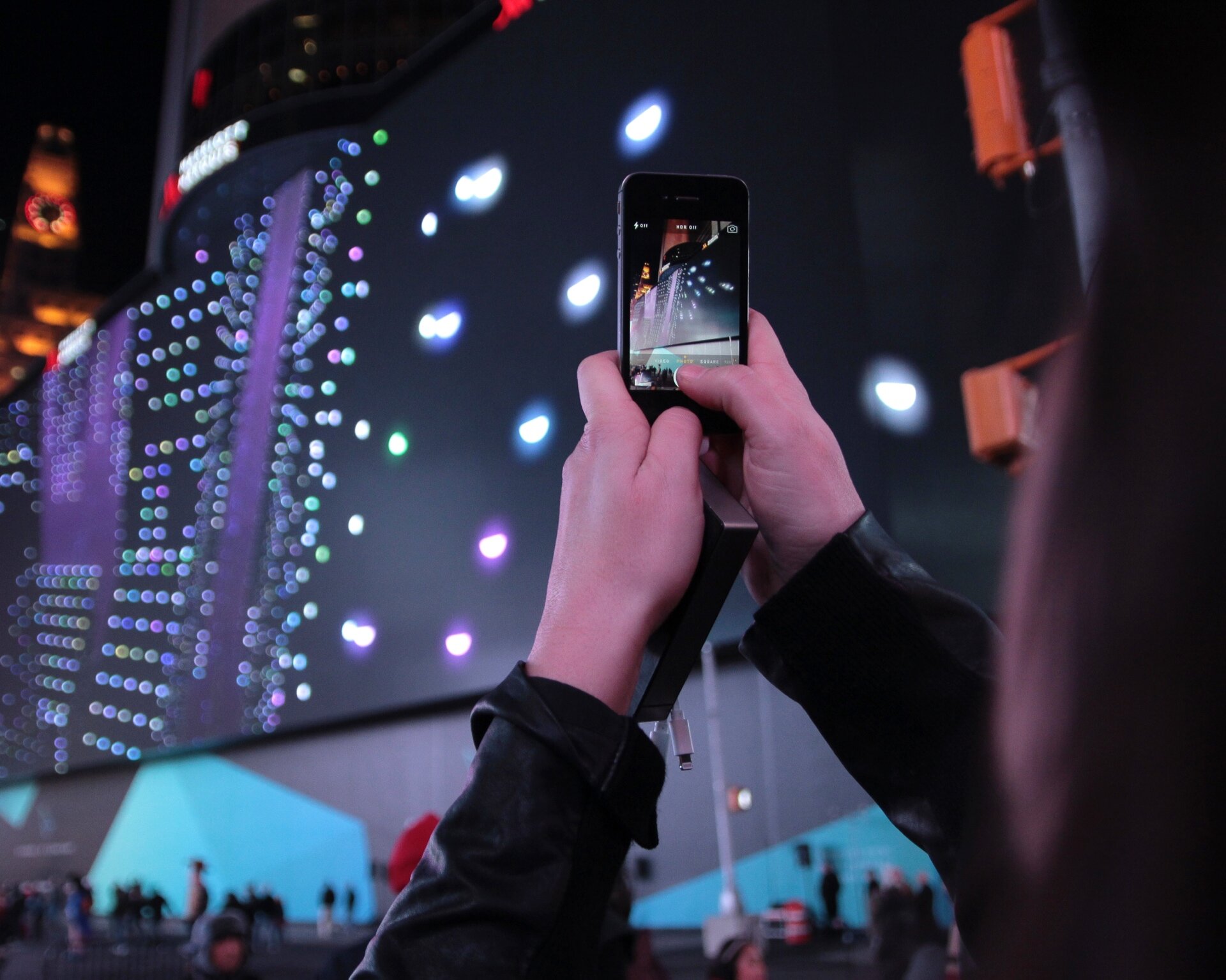
In collaboration with artist Universal Everything and Vornado, we launched a monumental LED display in Times Square and with it a new conversation about the convergence of art, commerce, and technology.
For over 500 media VIPs, we designed the entire event around the idea of transformation, the recognition that NYC is in a constant state of change.
We created high-touch invites with RSVP credentials and 3D printed objects intended to pique curiosity. We built up anticipation through social media and displayed a countdown clock before the event.
For the night of the unveiling, we crafted an interactive engagement intended to bring the LED display to life through a series of unique, generative films created by the guests.
In our experience, small groups of guests selected various characteristics of their films, including weather, time of day, bird type and soundtrack from a suite of interactive tablets. These characteristics were then rendered generatively into the films that then played on launch.
In addition to collaborating with the world's premier VFX artists, we also provided our guests with inspiration and music from Ghostly International's Heathered Pearls and light sculpturist Dev Harlin for a night of transformative art and design.
Year Completed 2014
Role Group Creative Director
Studio Second Story
Collaborators Vornado, Work Bench, Dev Harlin, Heathered Pearls + Ghostly International, Universal Everything
Results
There were an estimated total 530M impressions between November 17 and November 19 for blogs, news outlets, and social content referencing the 4k digital display in Times Square.
There were 7,335 overall mentions, with Twitter as the main source with 6,060 mentions followed by news outlets with 1,400 mentions.
There were 273 total mentions of #ChangeIsConstant from November 17 to November 19 in reference to the digital display.
Retail Companion
The challenge: Design a connected, digital tool that regional teams will be excited to leverage, allowing them to intuitively create custom merchandising campaigns to suit their audience needs with the purpose of increasing dwell time and conversion. The tool will need a separate dashboard that allows store managers to see analytics, manage connectivity and provide updates to the in-store demo devices.
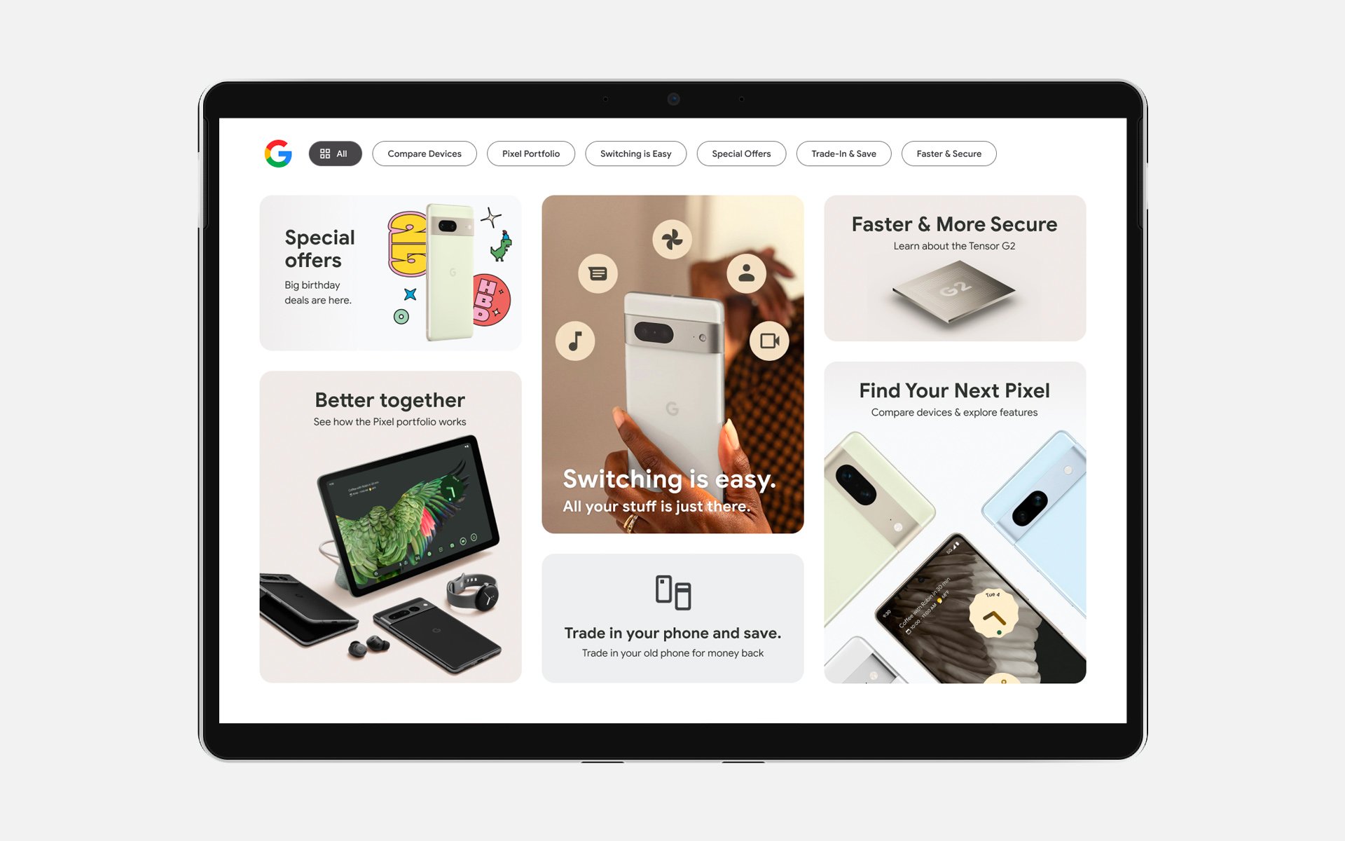
We took a consumer-centric, data-driven approach to creating a scalable, connected modular system that followed experience design best practices and Google Material standards in the retail environment.
We included interactive media, features that demonstrated the power of the Pixel phone, incorporated testimonials and rich media storytelling to help customers compare, shop and switch.
We also built a back-end analytics dashboard that gave regional managers the ability to track performance, adjust demo content, test new features and provide custom experiences based on the data back to the retail floor.
We also employed creative, interaction designs to differentiate and elevate the Pixel by showcasing device capabilities through interactive demos and storytelling content with an elevated, modern physical display design to showcase the technology and art of the Pixel.
Year Completed 2023
Role VP of Design, Consultant
Agency Nerdery
Collaborators Trevor Tillery, Grace Blondell, Ali Hohlt, Larry Sickmann, Kelly Brown
Cloud Next
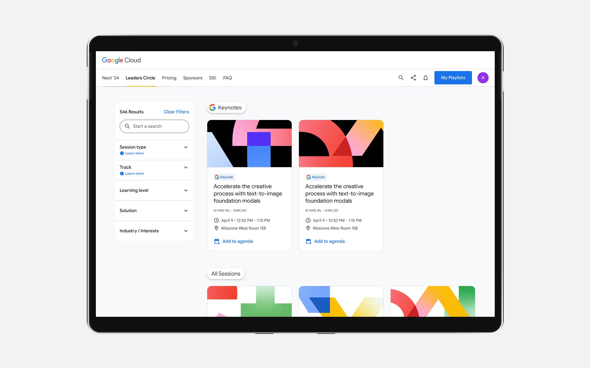
The challenge: Design and develop an integrated hybrid conference experience with robust session booking functionality, simple navigation for hundreds of speakers and sessions, a multi-channel livestream, and a mobile app to improve the attendee experience and increase participation.
Working in partnership with Google on every Next event since 2017, we deliver a holistic web and mobile experience for attendees, but in 2020, we had to get creative as we pivoted to virtual – including features such as track selections, user directories, and a notification center. Now, every year, Google Next is a fully hybrid experience – delighting both virtual and in-person attendees.
Our solve was to designed a scalable digital solution that delighted users by showcasing personalized content while seamlessly connecting in-person and virtual attendees with speakers, workshops and sessions.
We also gamified the experience by creating badges that showcased user engagement and participation. Plus, we facilitated a global hybrid event which included hyper-targeted experiences and valuable content for developers, and an improved Live Hub to accommodate a unique run-of-show.
Year Completed 2023
Role VP of Design, Consultant
Agency Nerdery
Collaborators Grace Blondell, Ali Hohlt, Larry Sickmann
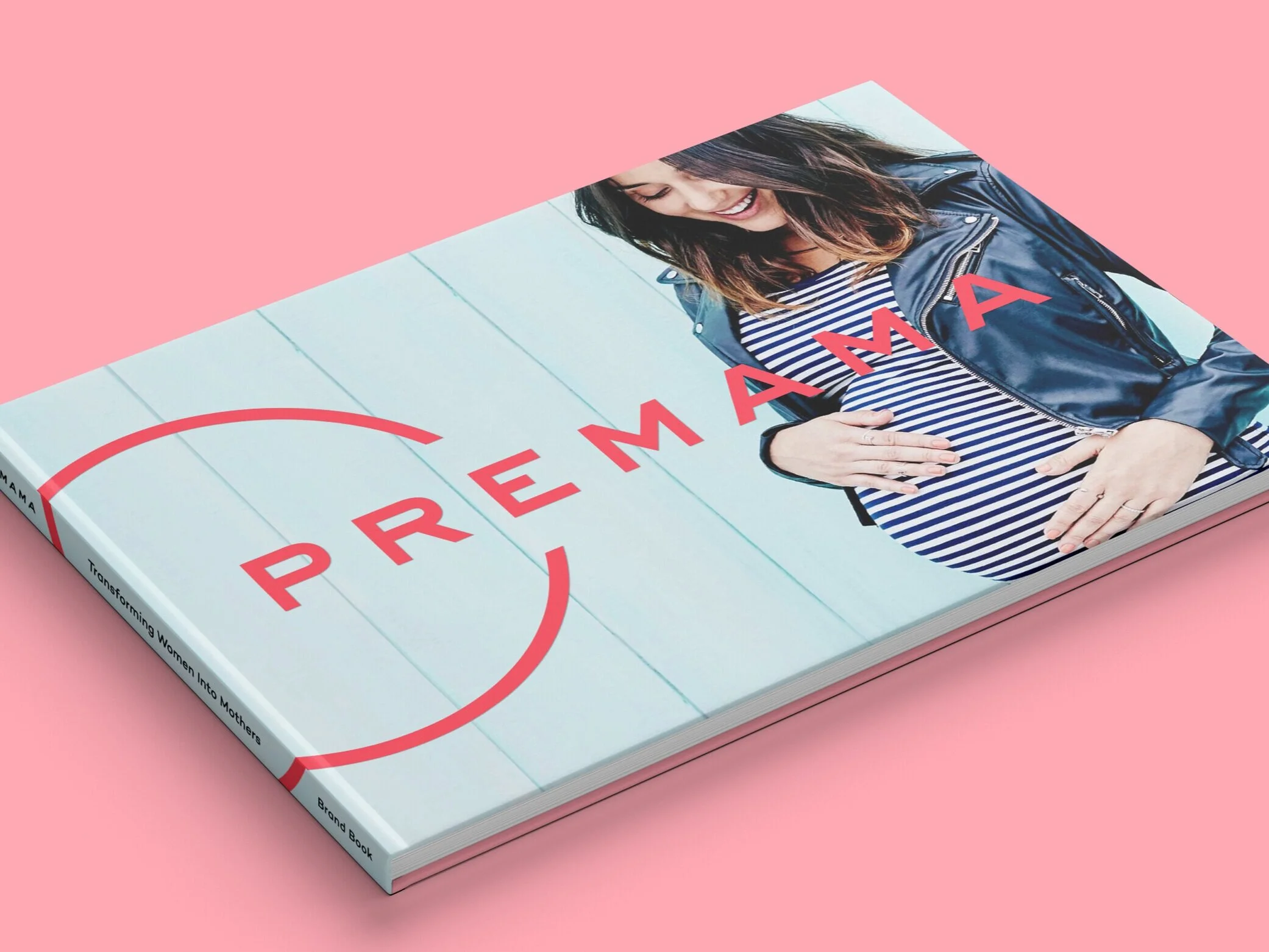
The challenge: Premama, an innovative prenatal vitamin company challenged us to re-position their brand with a clear value proposition, a unique visual system and a messaging strategy to appeal to savvy, wellness obsessed, parents-to-be.
No small task.
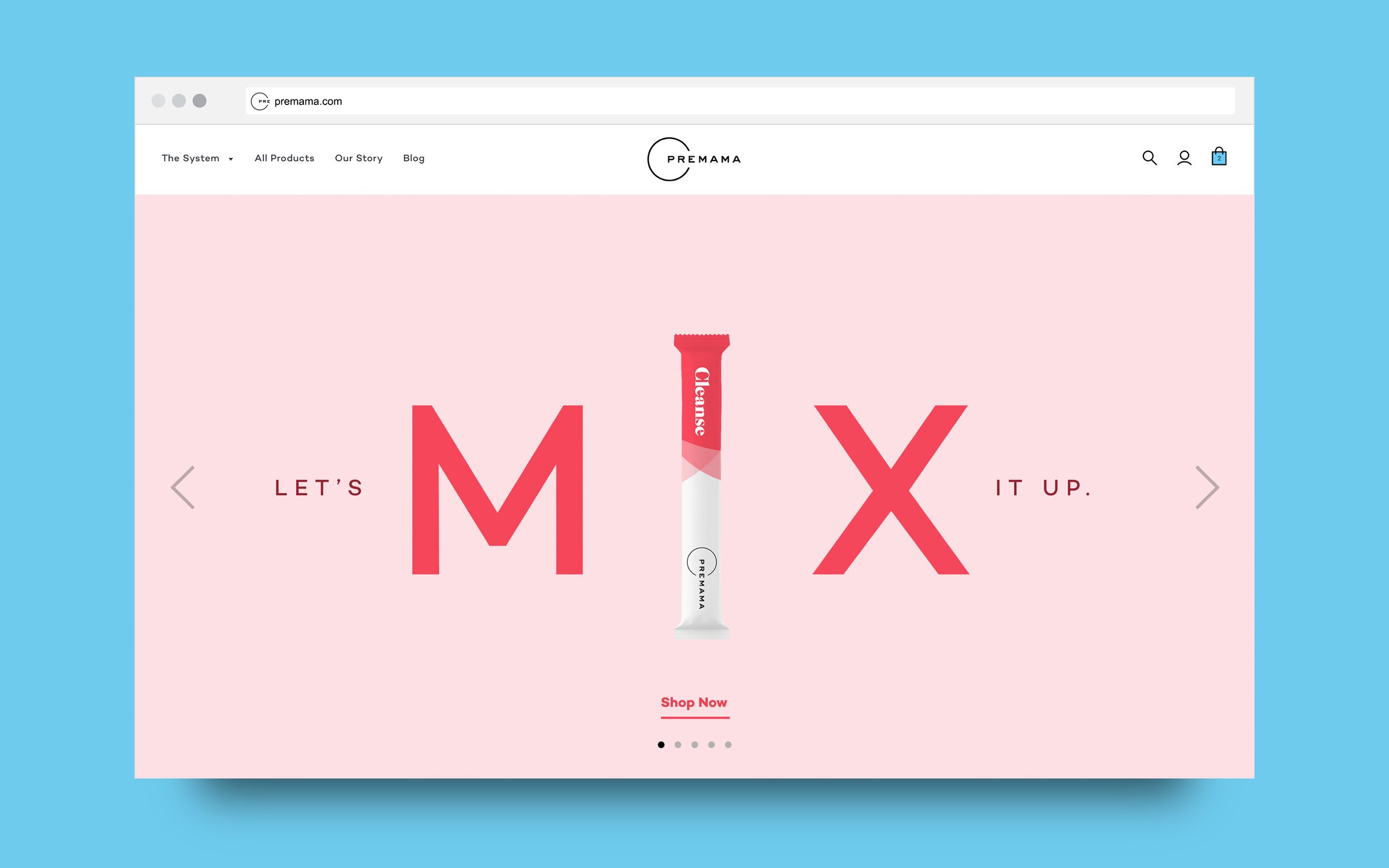
We started by rebuilding the brand's foundational elements, allowing us to rally around what Premama stands for. Our mission, to "Empower families to expect better." Our key message, "Transforming women into mothers."
We then created a design system to visually differentiate the brand and unify all communications with a reimagined logo, typographic elements, colors, and iconography.
We applied our design system to cylindrical packaging which was specifically chosen to stand off the shelf while also showcasing both prenatal and postnatal formats. A true family of products.
Next we created photographic treatments and guidelines to establish consistency across all content production, product imagery, marketing communications and media assets.
Finally, we developed an ecommerce site to not only sell and market directly to the consumer, but to tell the Premama story and educate our audience on all the benefits of dietary supplements.
Everything we did was with the mother in mind.
Year Completed 2018
Role Executive Creative Director, Design Director
Agency space150
American Express is a global services company, providing customers with “Powerful Backing” through products, insights and experiences that enrich lives and build business success. The “Powerful Backing” message reaches over 112 million business and consumer Card Members, 18 million merchants, and 120 bank partners that connect through the American Express Network globally across 130 countries.
Here just a few examples of work we've done for them.
OPEN: The Next Big Step
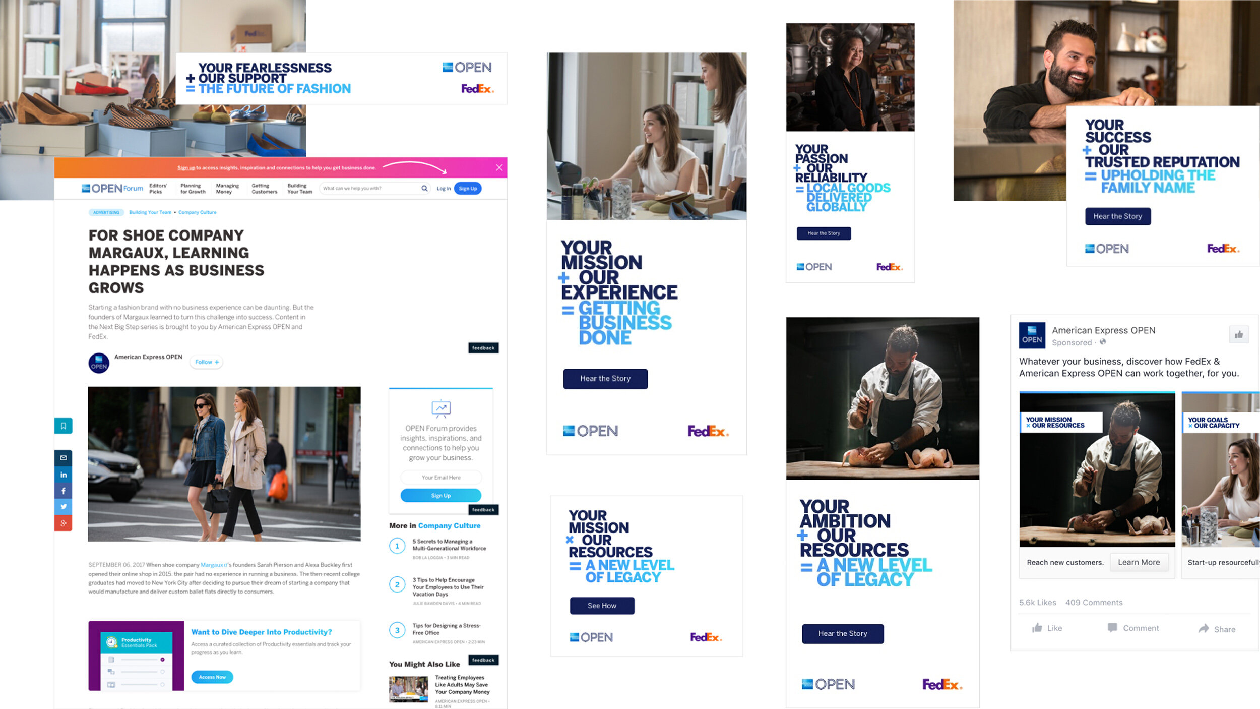
The challenge: American Express OPEN and FedEx offer exclusive benefits to small business owners but awareness is low. With a target audience that is strapped for time, we needed to create a campaign that educated small businesses owners on the statement credit they receive when they ship with FedEx by highlighting real challenges and obstacles other owners have faced.
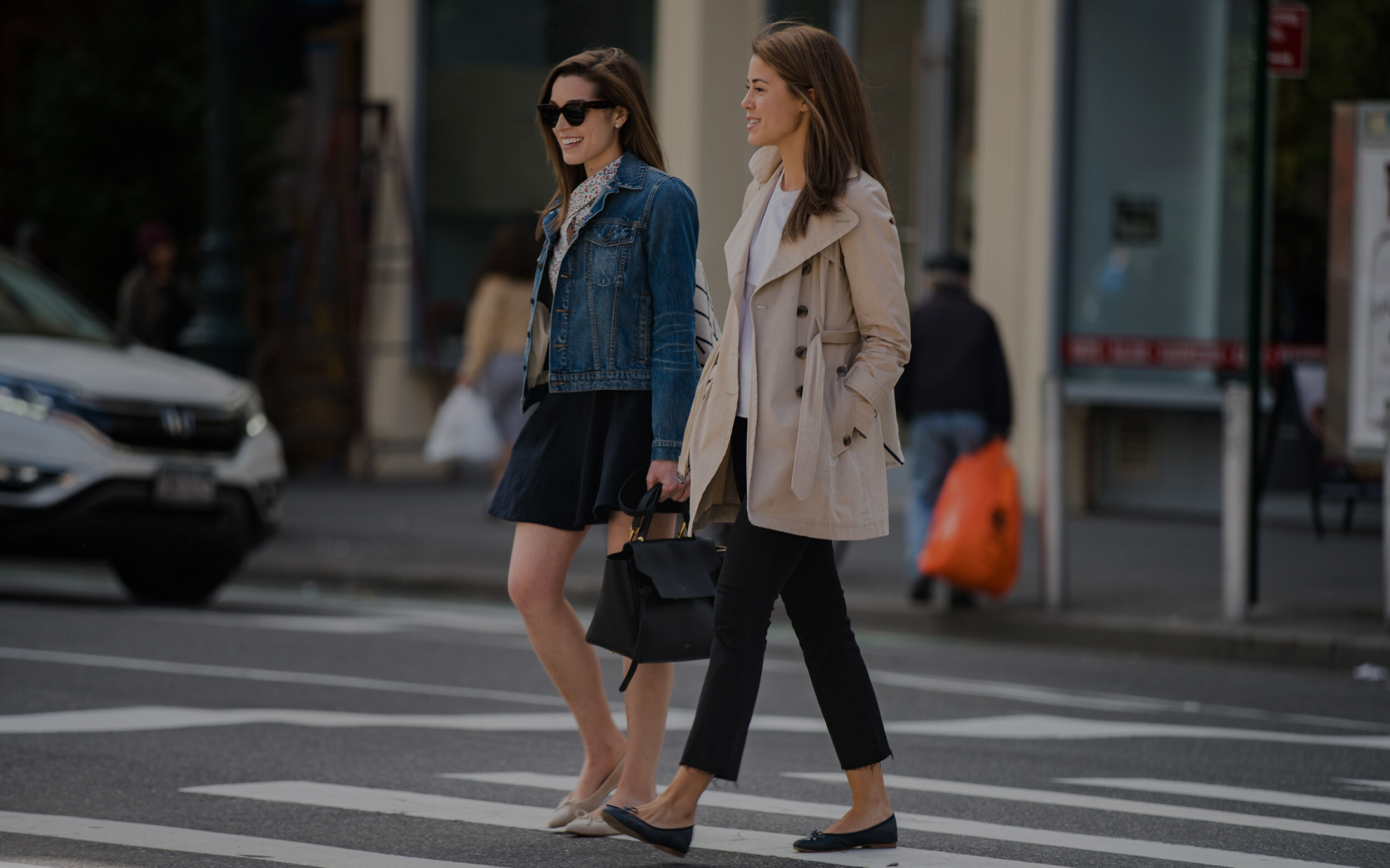
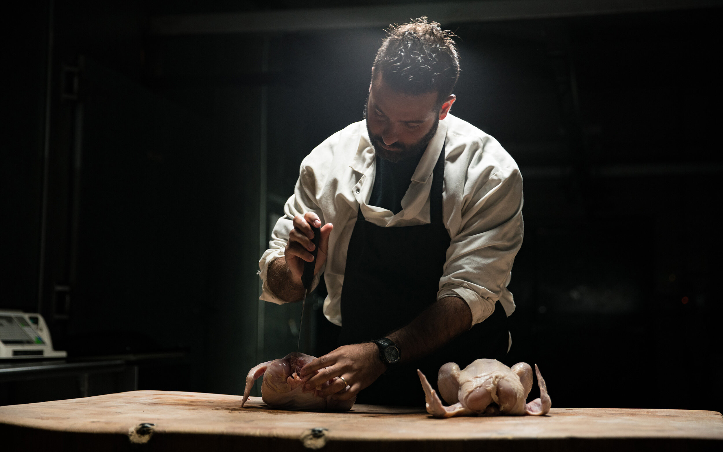
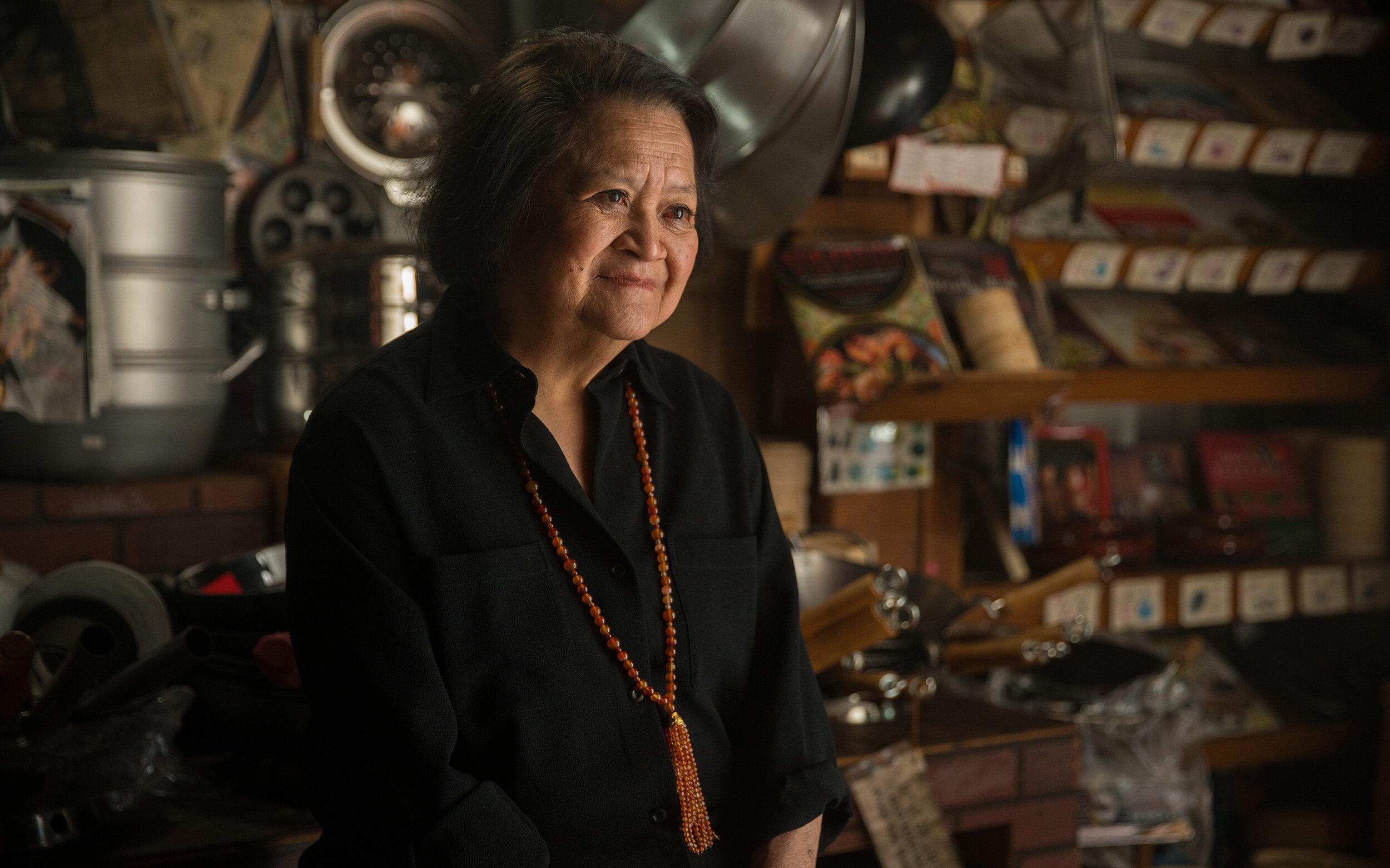
The campaign shared learnings from those who have experienced the benefits of this partnership in the form of online videos, paid social media posts and long form articles. Our content was filled with information designed to create a sense of community by focusing on how others have been able to take the next big step in growing their business.
Year Completed 2018
Role Executive Creative Director, Design Director
Agency space150
OPEN: Savings at Work Calendar
The challenge: Design a top-client mailer that promotes the American Express “Savings at Work” benefit while reminding company administrators and key shipping decision makers that FedEx and American Express are a powerful partnership.
We took one of mankind’s best stress relievers and perfect shipping motif, bubble wrap, and turned it into a fun, daily ritual.
The Savings at Work Calendar lets users pop bubble wrap each and every day while also providing them with key shipping dates and offer reminders mapped to dates printed behind the bubbles. The takeaway, FedEx can help manage your busy shipping periods while saving you money… even providing a moment of delight in the process.
Year Completed 2018
Role Executive Creative Director, Design Director
Agency space150
American Express: Refer a Friend Program
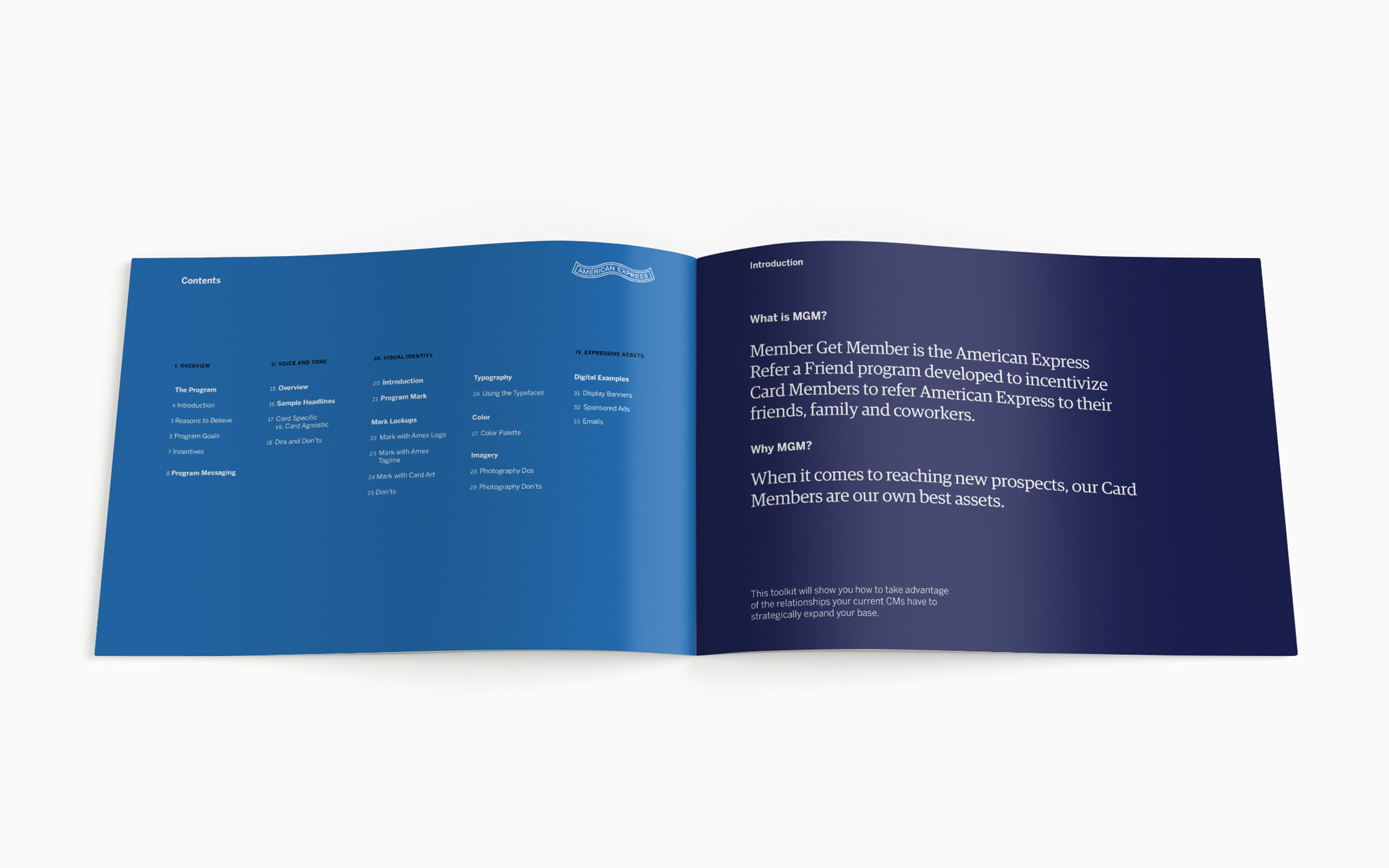
The challenge: Less than 2% of Card Members refer American Express. How can we get Card Members to understand the benefits of card membership and get them to refer their friends?
To increase awareness of the Refer a Friend program, we developed a campaign messaging strategy that targeted card members at the right time and place with a simple, altruistic message, “Share the benefits you love”.
To drive conversion we reinforced our message by giving card members a little something extra, Rewards points. Our call-to-action “Refer a friend. Get rewarded.” incentivized our campaign and served as a reminder of the benefits of being a card member.
In order to unify our communications we developed a program toolkit. We wanted to insure that Refer a Friend visually and tonally aligned with the American Express brand but was unique enough to stand out as a program.
To give the program an identity we created the Refer a Friend word-mark, a system of colors, fonts, templates and other design elements to give it’s personality, look and feel.
Working in close collaboration with legal, brand and marketing teams in agile, we delivered over 500 assets per quarter across multiple channels, including email, social, paid display, OOH and print. Over the course of two years we’ve produced over 2000 assets which has resulted in a 39% year over year referral rate increase, over 335k new accounts and 4 billion dollars in revenue.
Year Completed 2019
Role Executive Creative Director, Design Director
Agency space150
The Challenge: How do you engage guests in conversation about the future of interactive media and technology?
Fusion was an educational event showcasing the power of interactive storytelling in a connected LED environment.
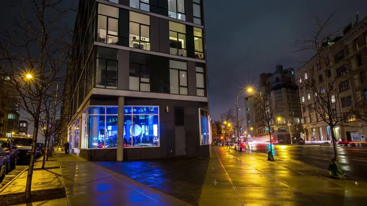
Our partners at Electrosonic invited over 200 media, technology, and design professionals to the LED LAB in TriBeCa with the goal of educating them about LED technology in a fun and dynamic way.
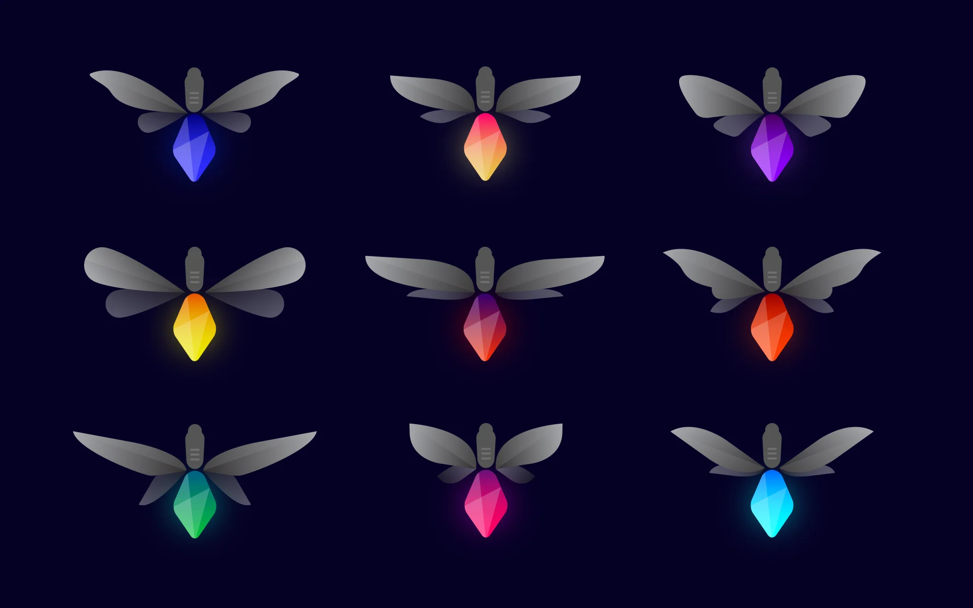
Our team was inspired by fireflies, specifically their similarity to LED technology in how they illuminate. We wanted to bring this to life in a way that created a memorable engagement.
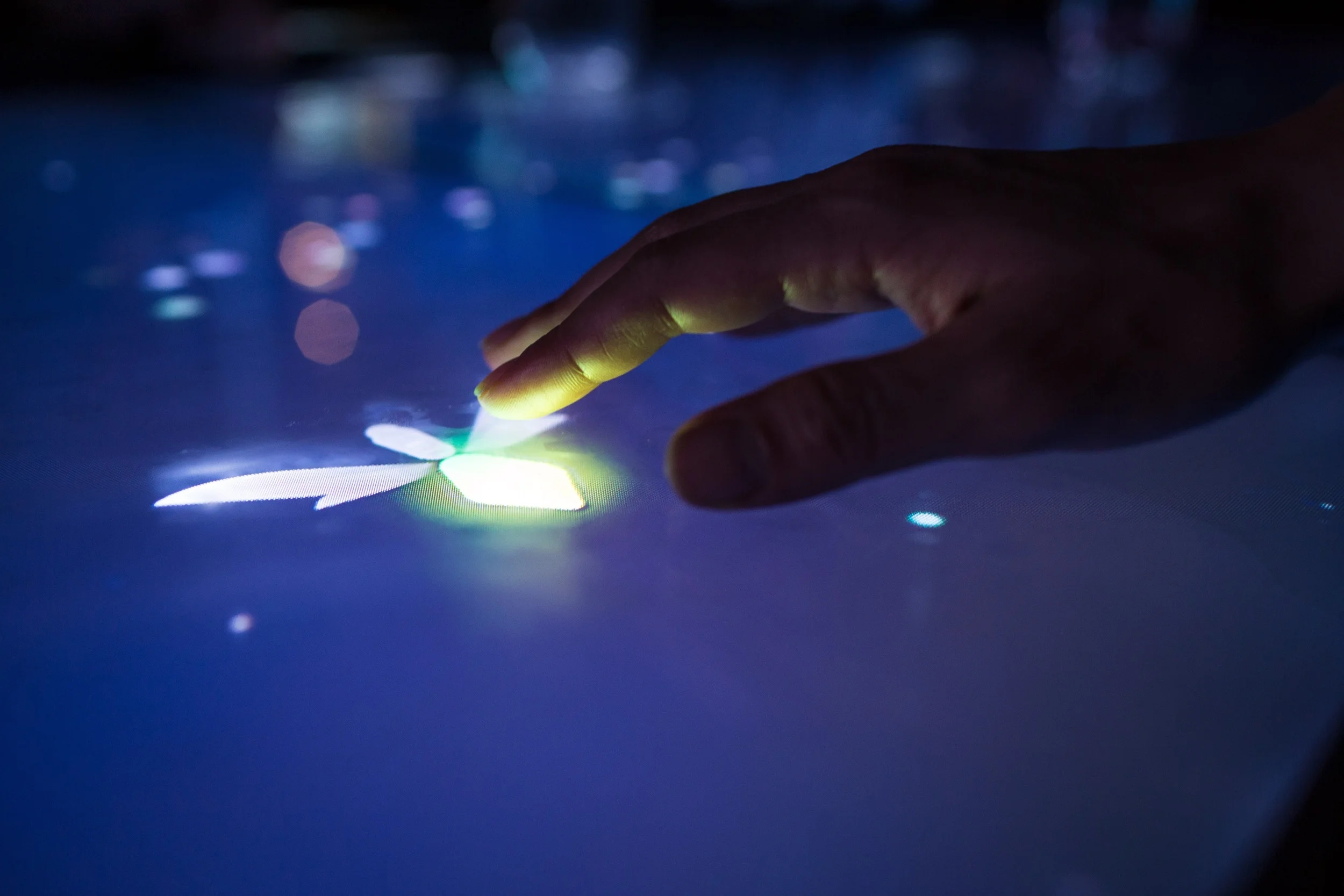
The experience began with an interactive table placed in the center of the space. Guests ‘caught’ uniquely designed fireflies by placing their hands on the surface and then through a series of touch interactions learned about LED resolution and pixel pitch.
On the surrounding LED screens, we created ambient, animated landscapes that enveloped the room. Guests could send their fireflies into the environment and experience their pixel pitch lessons in real-time.
By merging media and technology with the unique architectural qualities of the space, we created a fun, immersive experience that inspired guests and established Electrosonic as integrators of the future.
Year Completed 2015
Role Creative Director
Studio Second Story
Collaborators The LED Lab, Electrosonic
The Challenge: Design an interactive guide for the 2014 Whitney Biennial.
In a city rich with celebrated cultural institutions, New York’s Whitney Museum of American Art shines as the preeminent destination for the art of the United States.
The museum’s 2014 Biennial exhibition offered the points of view of three curators, each overseeing one floor of the Museum. They brought together more than one hundred diverse participants to provide an expansive perspective on art in the U.S. in 2014.
To give visitors the full experience, we designed an app on Windows phones exclusively for the biennial to guide visitors through the exhibition and encourage deeper dives into its eclectic selection of works.
Users could browse the exhibition by floor, explore on their own, take a guided tour, or search for more information about a particular artwork or artist. Audio and video interviews with the artists gave their work greater context, encouraging visitors to better know the pieces and their creators.
The app enabled users to delve into the Whitney’s impressive permanent collection, access information about upcoming events, and learn more about the museum’s 2015 move into its new space, a building designed by influential architect Renzo Piano.
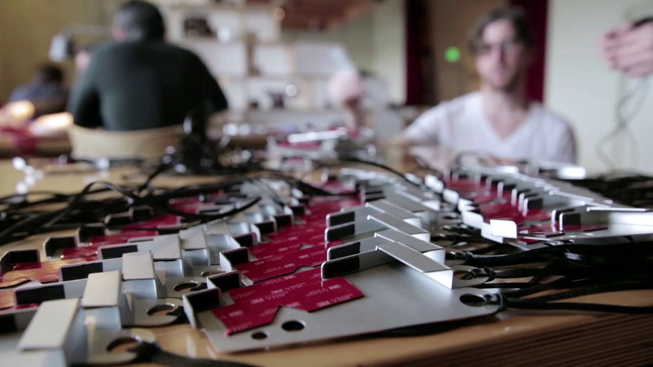
We also designed and implemented a custom case solution for the Nokia devices running the mobile app. Made from laser-cut anodized aluminum, the cases helped ensure the phones’ longevity by protecting them during heavy use.
Year Completed 2014
Role Creative Director
Studio Second Story
Collaborators The Whitney Museum, Microsoft
The Question: What happens when the story finds you?
In collaboration with UK artist Lucy McRae we created a storytelling experiment exploring how presence, physical space, technology and human intervention can combine to tell a story.
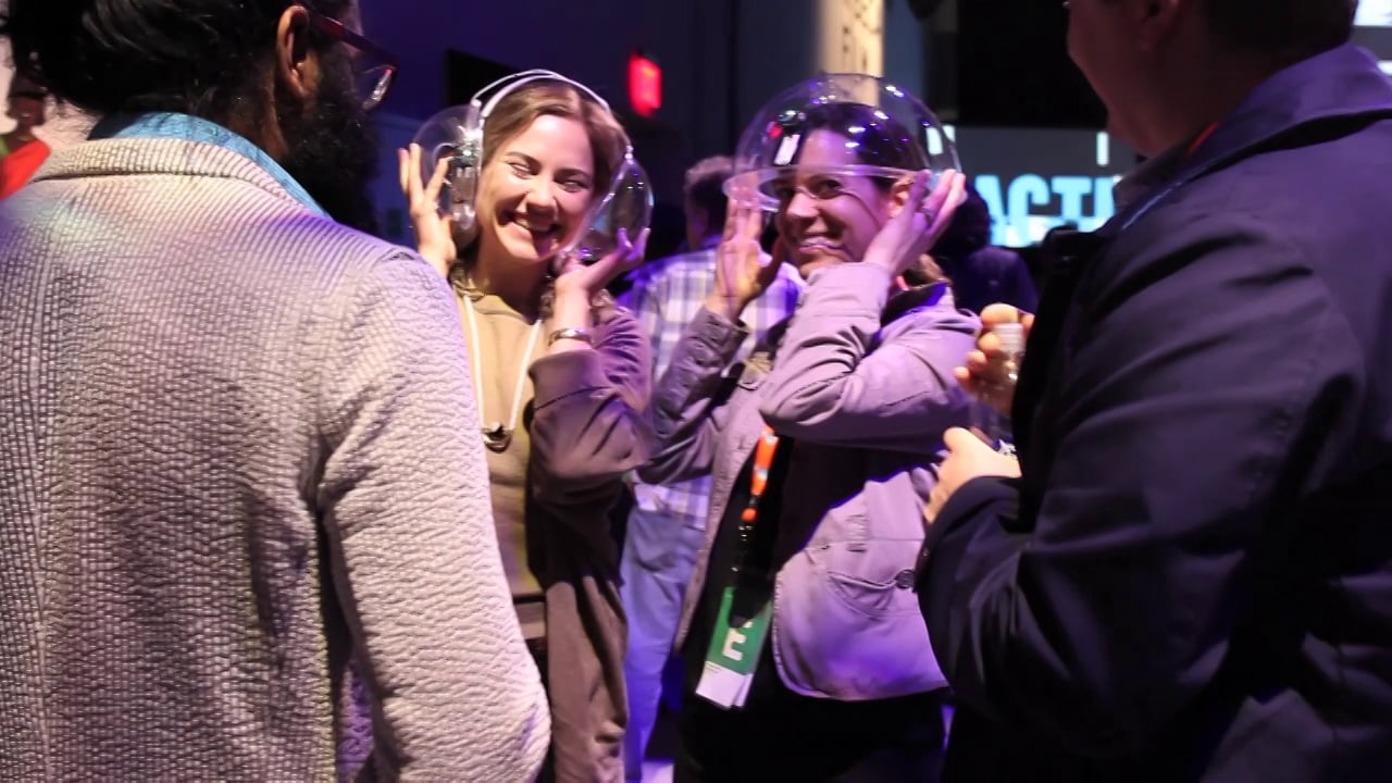
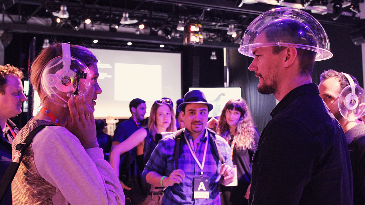
In Here to There, TFI Playground attendees were handed a set of uniquely designed headphones and told to explore the space around them. They were encouraged to try and unlock a futuristic three-part narrative through the use of custom made beacons embedded within the earpiece.
Our actors, who wore similarly designed helmets, were also given instructions to roam the Playground. When they came into close proximity with our participants, their beacon pushed a part of the story to them. Aided by the choreography of the actors, participants experienced a non-linear narrative through their interactions with the space.
The experiment was designed to explore ways in which we can connect people to place, with each other, and to see what happens when we give the audience and actors agency in the process.
We create an experience that delighted the crowd and provided plenty of photo ops. Here to There took social media by storm and was prominently featured in the Tribeca Film Festival’s “Daily Wrap Up” video.
Year Completed 2015
Role Creative Director
Studio Second Story
Collaborators Tribeca Film Institute, Lucy McRae
The Ask: How can Levi’s enhance the retail shopping experience?
Levi Strauss & Co. has been innovating since the first pair of jeans in 1873. Throughout their long history, Levi’s has inspired change in the marketplace, the workplace and the world.
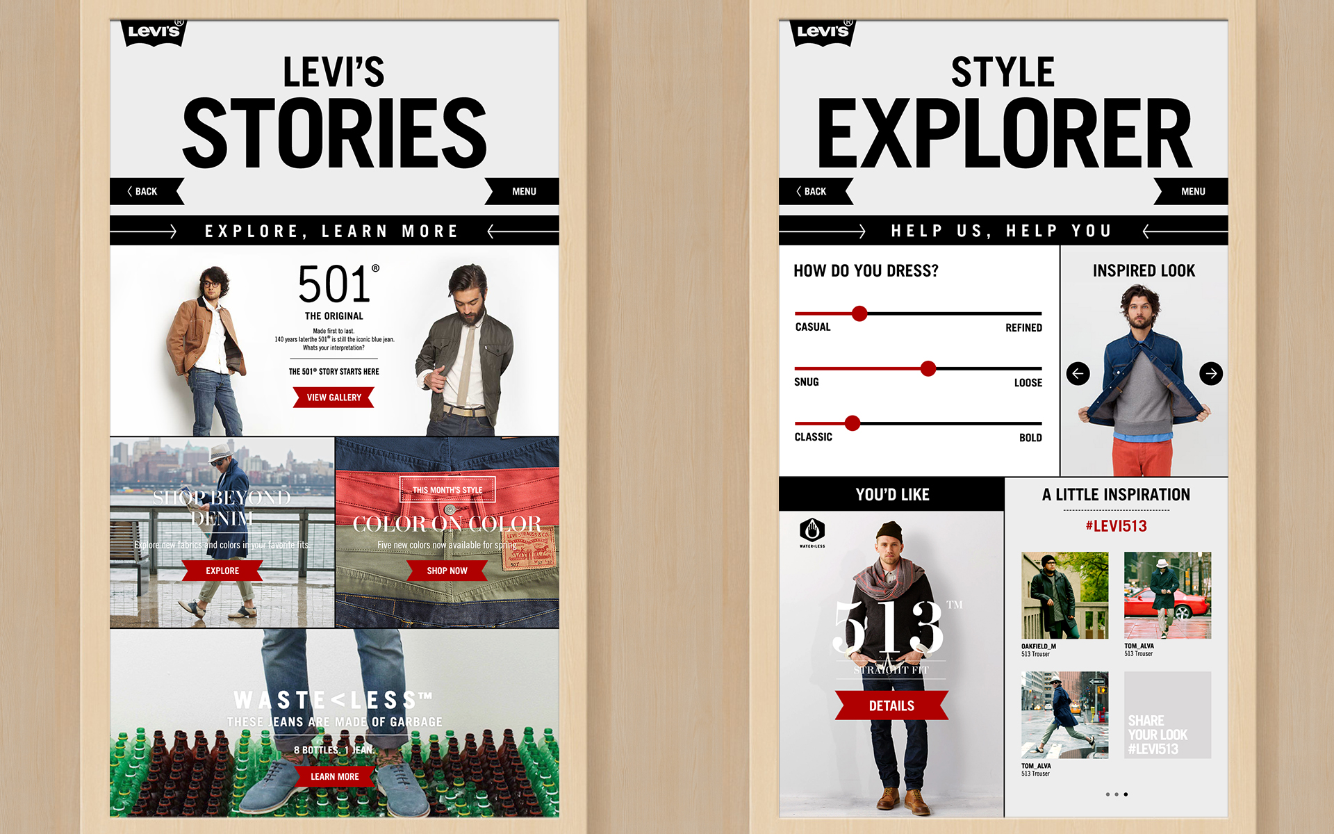
To continue their legacy of innovation, we created Denim Discovery, a digital merchandising concept that provides shoppers and associates with an ecosystem of interactive touch-points designed to inspire, educate and seamlessly complete the purchase.
Digital signage, interactive floor displays and connected POS tablets help customers find the perfect fit, compare styles, browse colors, and share their looks with the world.
Redesigned floor fixtures integrate the interactive with contemporary design features and finishes completing the look.
Year Completed 2013
Role Creative Director
Studio SapientNitro
Collaborators Macy’s, Levi Strauss & Co, Iron Creative
Results
45% Increase in customer dwell-time
50% Increase in sales overall
15% conversion on new fits and styles
Average engagement of 2 1/2 minutes
The Ask: Design an interactive installation that tells the powerful, human story behind the science of Pharmacogenomics.
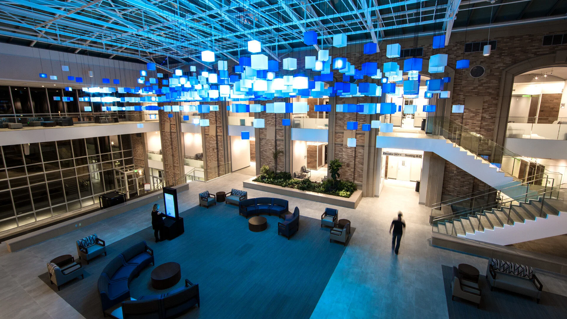
What if integrating genetic medicine into your regular primary care regimen could make you healthier and lower your healthcare costs? This is the vision behind Sanford Imagenetics. We built an immersive installation to get patients onboard with this revolutionary change.
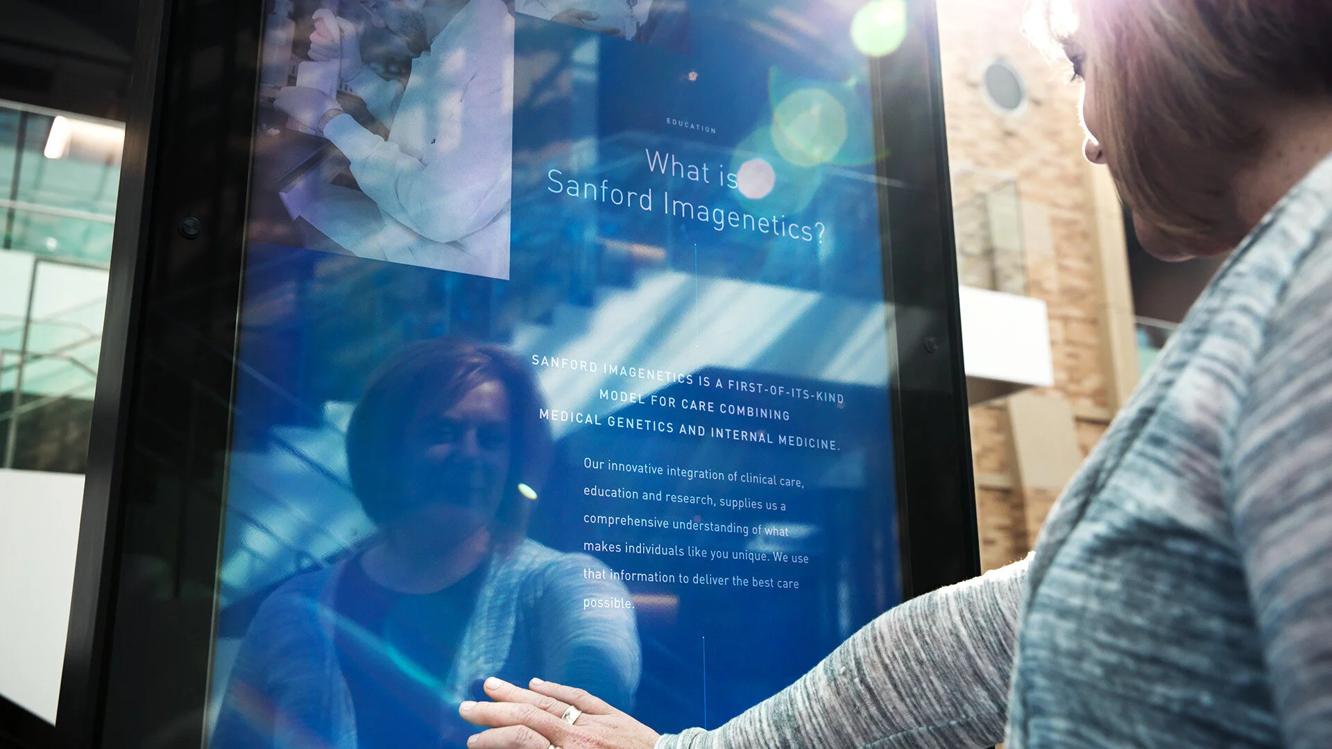
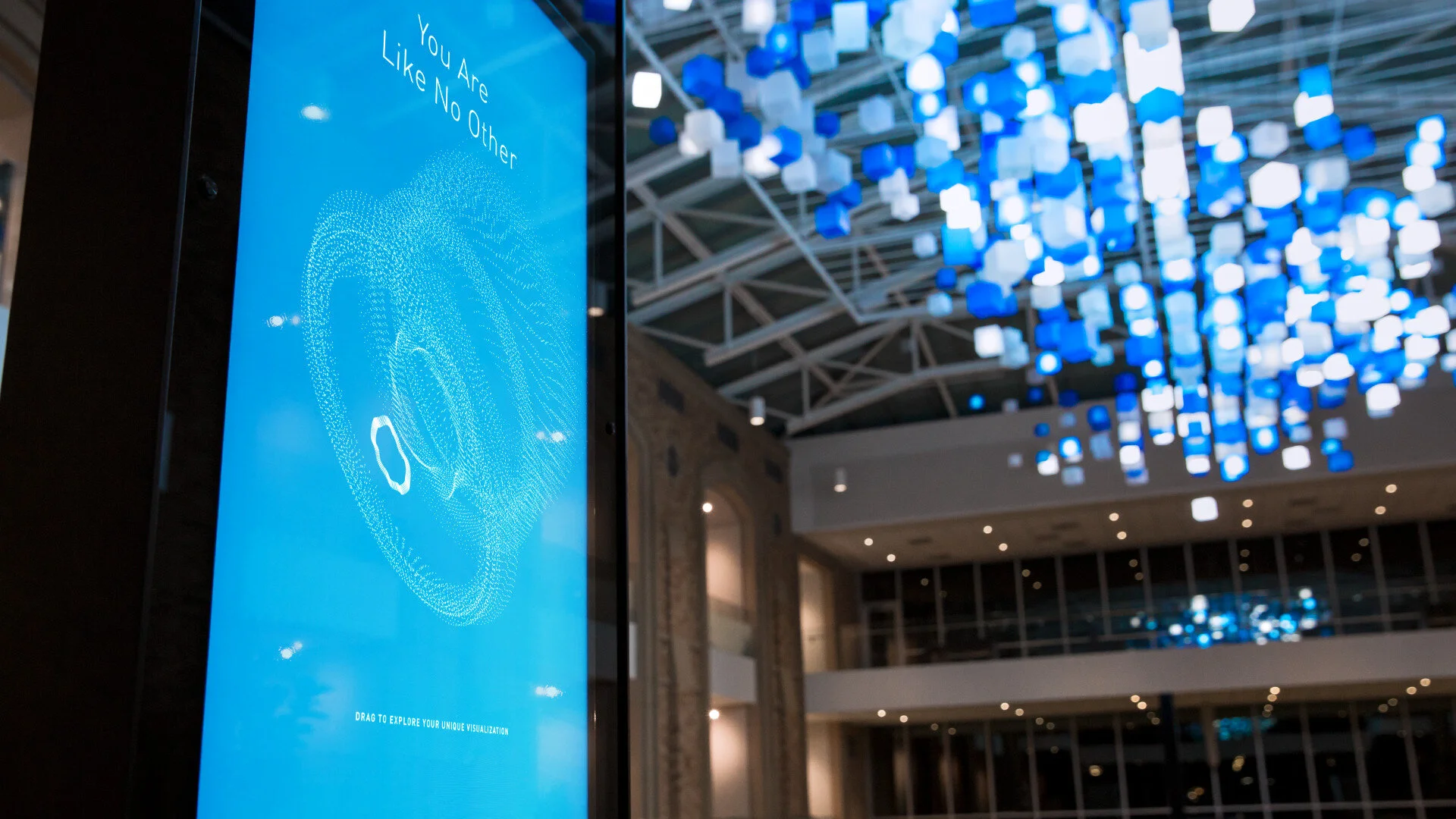
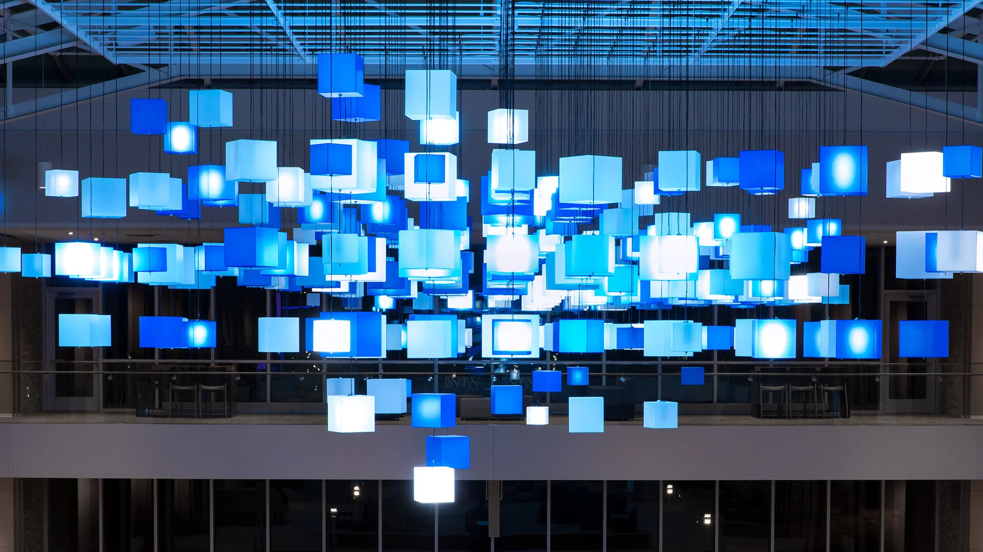
In a patient thoroughfare at the heart of the Sanford Health campus, we used a hanging light-sculpture, two floor displays and responsive technology to turn a regular doctor’s appointment into a disarming first encounter with genetic medicine.
The floor displays issue playful invitations to engage, eliciting voice and facial inputs from passersby. This biometric data triggers an on-screen visualization—inspired by the unique individual patterns of DNA—which is then reflected in the twinkling animations of the light sculpture overhead.
By using the entire environment as our storytelling canvas, we sparked curiosity about genetics and introduced patients to a realm of wondrous possibility for health care.
Year Completed 2017
Role Creative Director
Studio Second Story
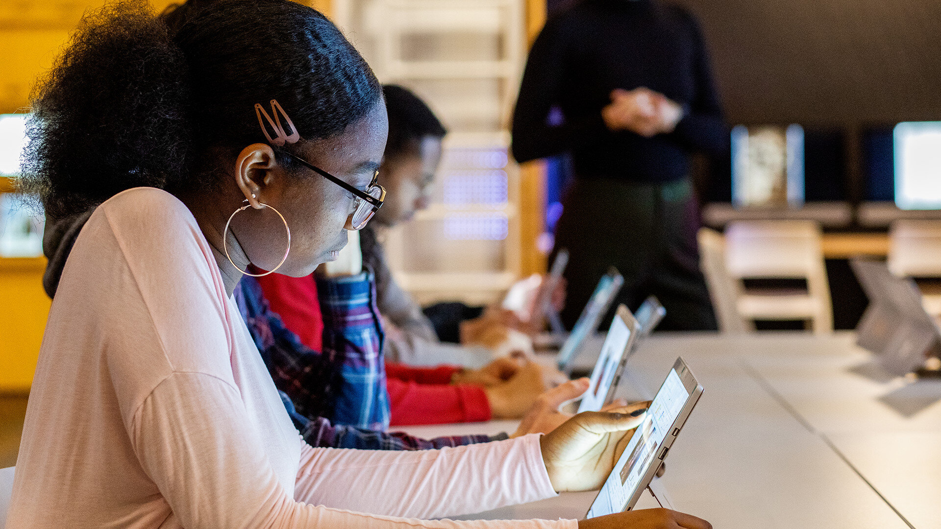
The Ask: Concept and design a technology forward space where NYC teens can come together and discover the relevance of history in the city’s oldest museum.
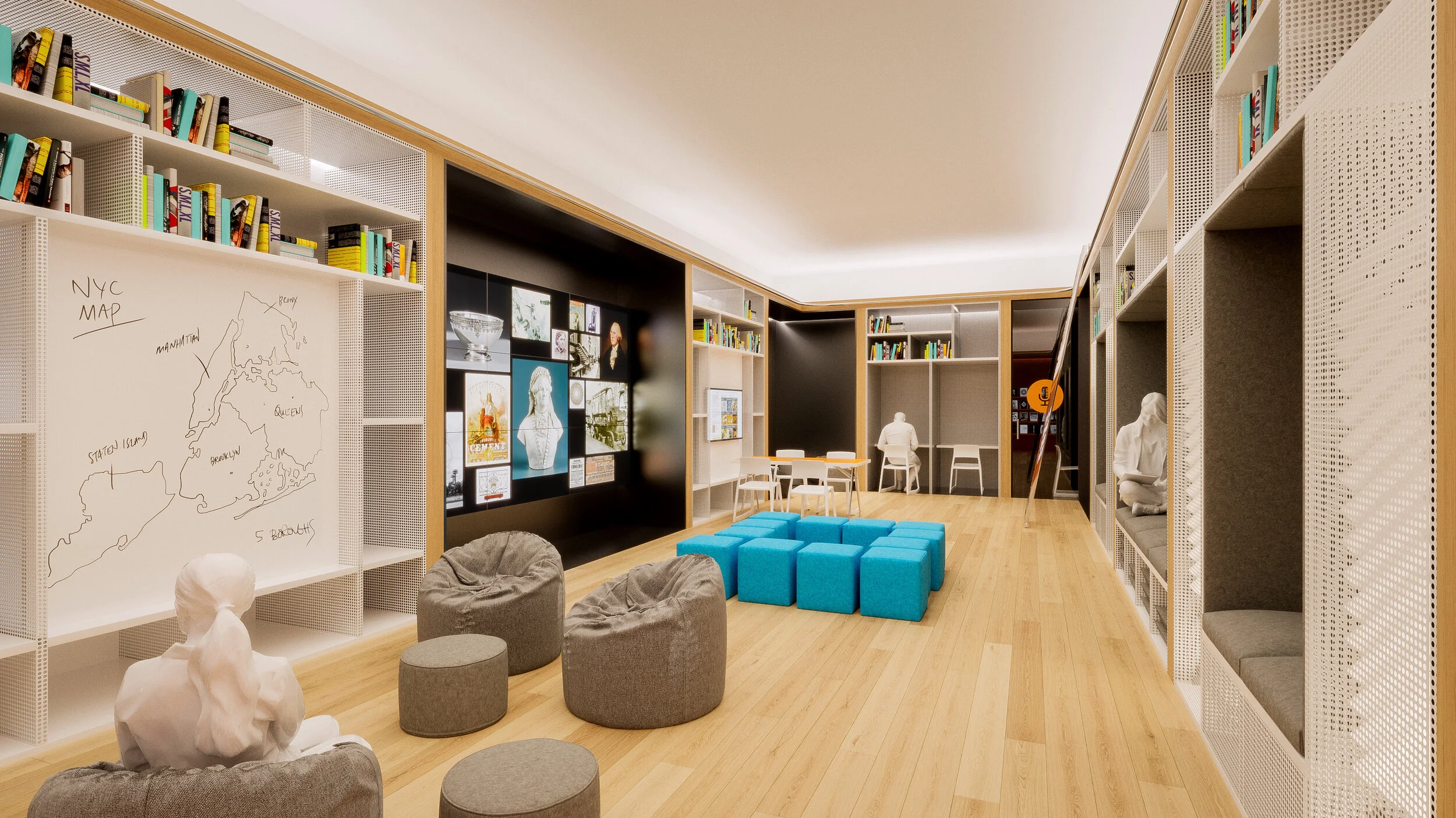
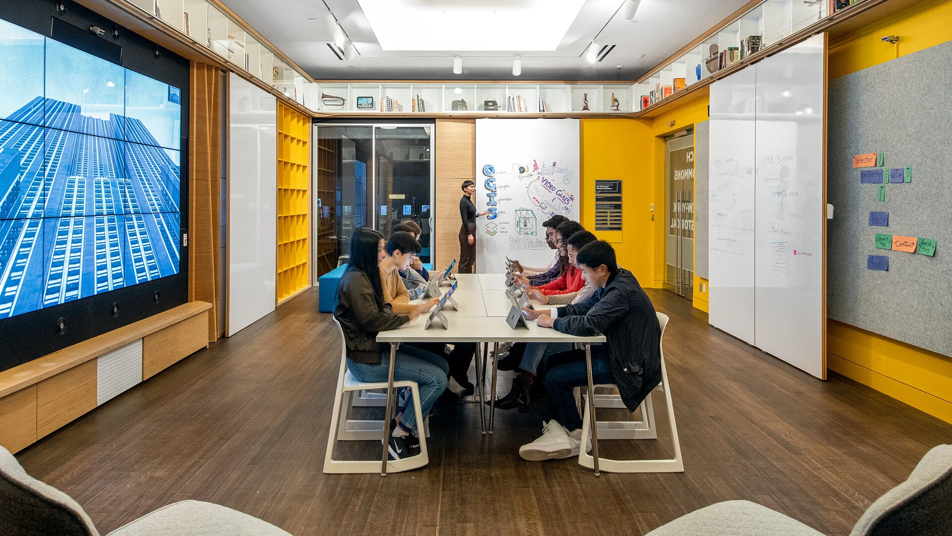
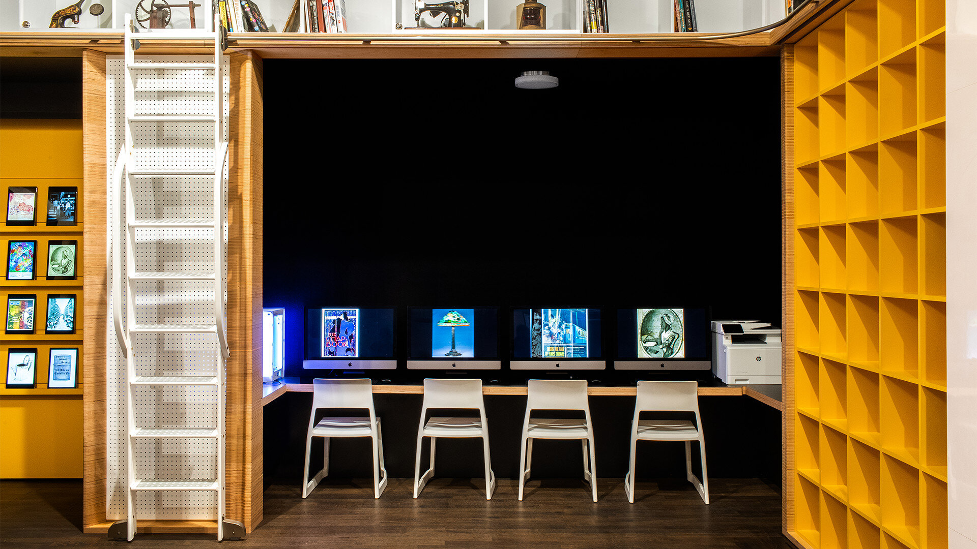
We teamed up with architect Dan Gallagher, of DGGARCHITECT, to design the Tech Commons @ New-York Historical, a collaborative multimedia maker space just for teens that gives them unprecedented access to the museum’s collections through state-of-the-art creative technology.
From 3D printer to 360-degree camera, the Media Lab is full of tools that inspire new ways of looking at and engaging with historical artifacts. Students are encouraged to research, prototype, document, and submit original projects—from podcasts to websites to animated films—that illuminate New York or American history using the museum’s materials.
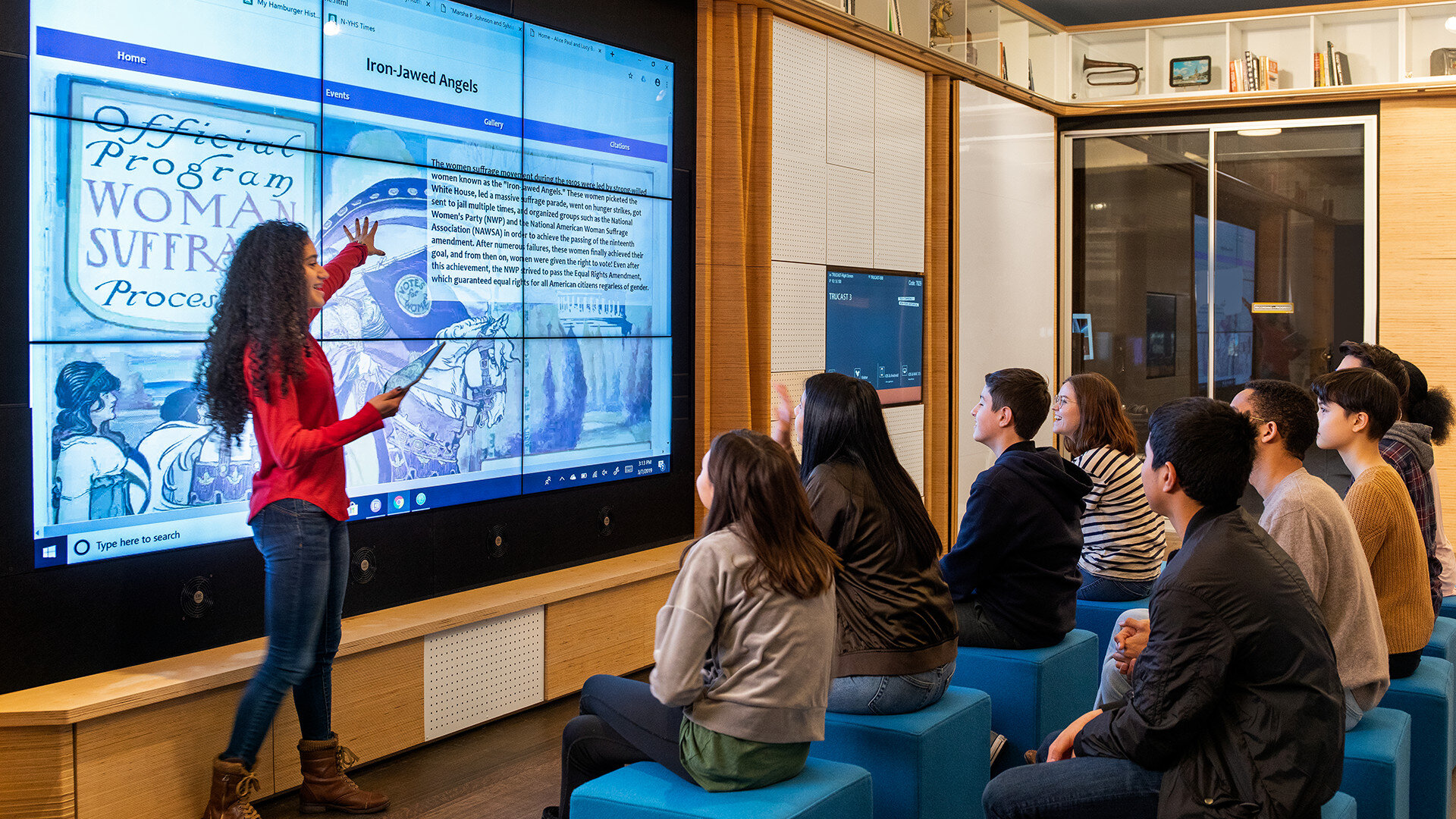
Teens can share out finished work with their peers using an oversized Media Wall. Located in an open space that can be reconfigured for different uses, the Media Wall also enables lesson-based learning from scholars, educators, and curators, turning the Tech Commons into as much a space for dialogue as for making.
In engaging teens of all backgrounds in the study of our collective past, the Tech Commons is empowering our collective future.
Year Completed 2017
Role Creative Director
Studio Second Story
The Question: What if you could publish music to place?
Imagine if you could search maps for music, or publish content to any location in the world. What if you could hear Dr. Martin Luther King’s “I Have a Dream” speech standing on the spot where he gave it.
Drop is a geo-publishing platform that gives users the ability to record, upload and publish their content anywhere as Drops.
Users can discover and listen to music in the context of the place in which it was published, providing deeper meaning while providing a powerful distribution tool for labels, offices of tourism and fans alike.
Users can like, share and integrate their social channels seamlessly for reach and extended participation.
Year Completed 2013
Role Creative Director
Studio SapientNitro
Collaborators Google, Tim Fielding
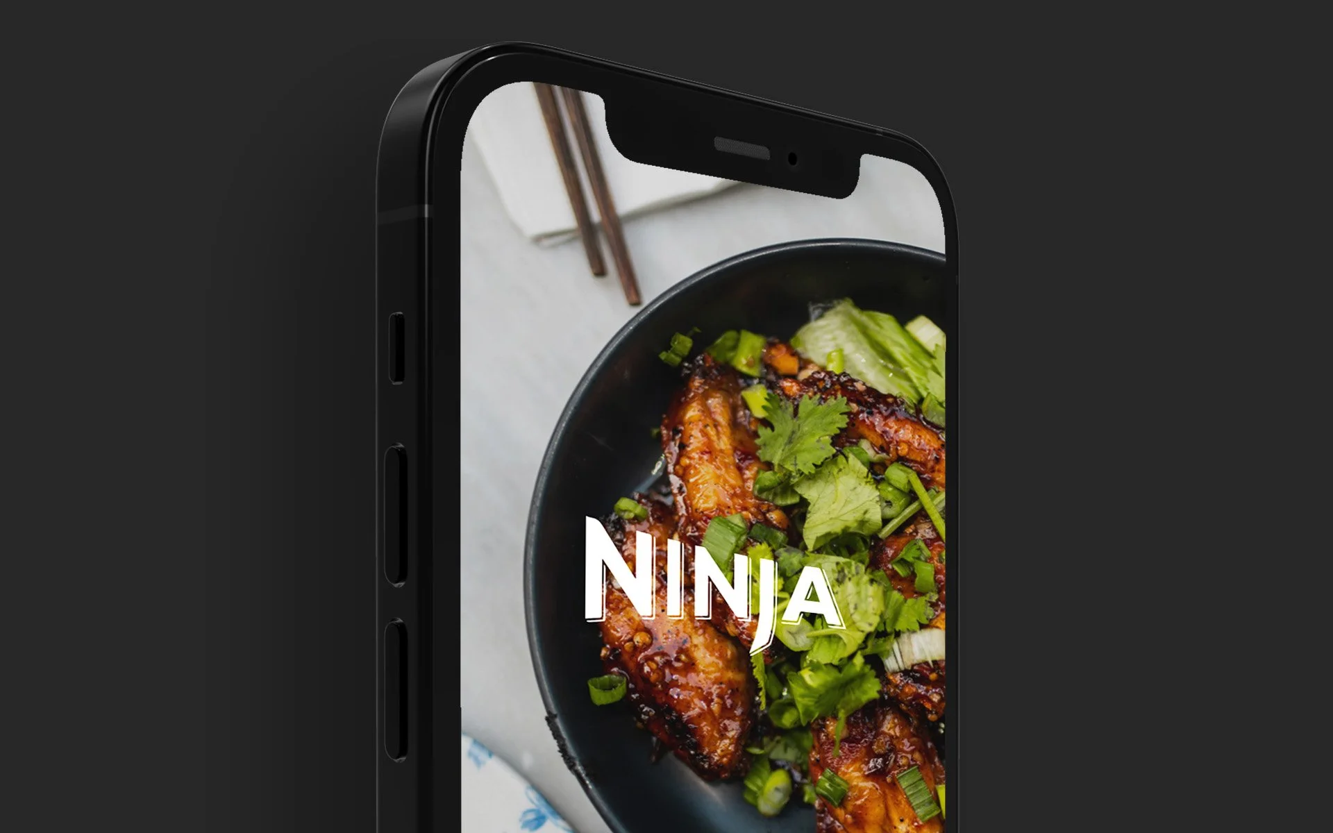
Meet the Ninja Woodfire Outdoor Grill & Smoker. It gives users the ultimate outdoor cooking experience with a powerful grill that Master Grills, BBQ Smokes, & Air Fries with authentic smoky flavor. Powered by a connected app experience, electricity and flavored by real burning wood pellets, Ninja Woodfire Technology allows you to easily create rich, smoky flavor you can see and taste.
The Challenge: Design and develop a mobile-first connected grilling experience to onboard new users, drive user’s first cooking success, and inspire continued use, engagement and product exploration.
To do this, we created a highly personalized experience by leveraging user data and preferences through a frictionless onboarding experience.
We designed an interface that prioritized functionality and ease of use to address the complexities of modern grilling techniques while highlighting the form factor of the grill.
We also established a unique grilling community by leveraging user generated content, feedback and a recommendation engine based on preferences, frequency of use and recipe ratings.
Year Completed 2022
Role VP of Design, Consultant
Agency Nerdery
Collaborators Jay Strehlow
The Challenge: Overhaul site design and usability to deliver greater value and differentiation with the goal of driving more conversion.
Eagle Strategies is Agent Driven. This is not just how products are sold, it’s how they are sold best. Financial agents are the sales force and connection to policy holders. Eagle Strategies is committed to Digital Innovation. The website serves as an accelerant to the existing agent business model. It should educate and nurture leads by providing a highly engaging experience throughout the journey.
Our approach to the experience considers three things; Functionality, Form and Usability. Our design methods integrated strategy, creative and engineering. Experts from each team worked closely together, focusing on the overall success of the user experience. To this we recommend a design process that puts their audience at the center of it all.
We made use of modular layouts, styles, images and media queries. The goal was to create an experience that scales to users screen size and orientation.
In the end, we transformed their existing site experience, made it feel more editorial with content that focused on insights and financial thought leadership while hearing their agent and ease of scheduling a consultation.
Year Completed 2018
Role Executive Creative Director, Consultant
Agency space150
The Challenge: Will A.I. evolve the way consumers shop?
We believe speech recognition, machine learning and trait analysis will drive deeper levels of consumer engagement with brands, products and services to create a whole new level of personalization.
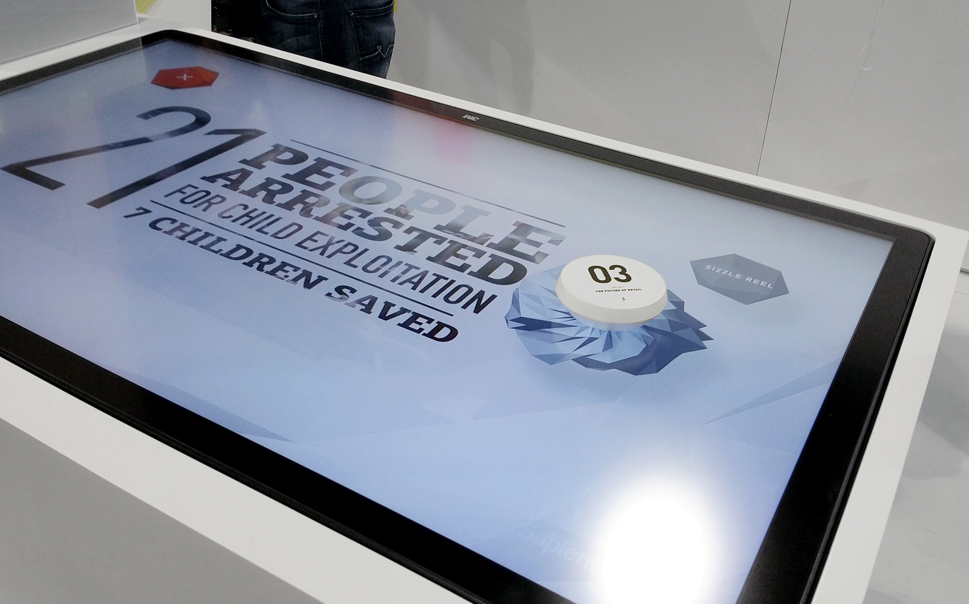
At the 2016 Digital Retail Summit, Second Story, in partnership with SapientNitro, Luminoso and Nuance, explored how artificial intelligence could be used to evolve the way in which consumers shop.
We designed and developed the installation concept, consumer facing application and booth design for the experience.
The application interface is intended to facilitate simple conversational interactions with the AI while visually providing user data and feedback to illustrate the complex relationships happening between the user and machine.
The booth is designed to reflect a speculative, future-leaning visual approach using a fractal forms for the structure. We finished the exterior with an iridescent material augmented through LED light to make tangible the voice of the AI.
Finally, to complete our perspective on retail, we created an interactive, digital table to feature case films that reveal the full breadth of retail and commerce offerings at SapientNitro.
Our goal is to demonstrate the possibilities artificial intelligence and to experiment with the potential of conversational retail experiences.
Year Completed 2016
Role Creative Director
Studio Second Story
Collaborators Luminoso, Nuance, Soft Lab
The Challenge: Redesign Sony.com
Sony is one of the worlds largest product and entertainment companies in the world. They changed the gaming landscape with the Sony Playstation, and evolved professional photography with their line of Alpha DSLRs.
So how does Sony tell their story online in an innovative way?
Sony.com reimagined the user experience by turning every page into a home page, providing focus and intent with on-screen content. Upon landing on the site, users were given a real-time feed of activity across the Sony network. From there users could page up and down to browse different categories of content while paging left to right to dive deeper into the category.
Integrated APIs, social media, customer ratings and reviews anchored the experience providing context and feedback along the journey.
Year Completed 2011
Role Art Director
Studio SapientNitro
Collaborators Sony Corporation
The Ask: Design an interactive storytelling tool for the "Future of Retail" installation at the 2011 iEX Conference in NYC.
Every year SapientNitro hosts a global client summit geared toward senior-level marketers and influencers. In 2011 they explored the ways in which technology influences our daily life, specifically how technology has changed the way humans go about being human.
An aspect of this broad ranging conversation is the future of retail. In a rapidly changing world, a lot of retailers are wondering how technology will change consumer behaviors and expectations.
To address this we designed an interactive installation that remotely provided guests with key industry trends and emerging insights to consider directly on their mobile devices. Guests could use a web browser to connect to the installation and browse a range of topics by guiding an onscreen avatar to the topic of interest.
Year Completed 2011
Role Experience Designer
Studio SapientNitro
Collaborators SapientNitro
The Ask: Design an experience around fan engagement at the new Meadowlands Stadium.
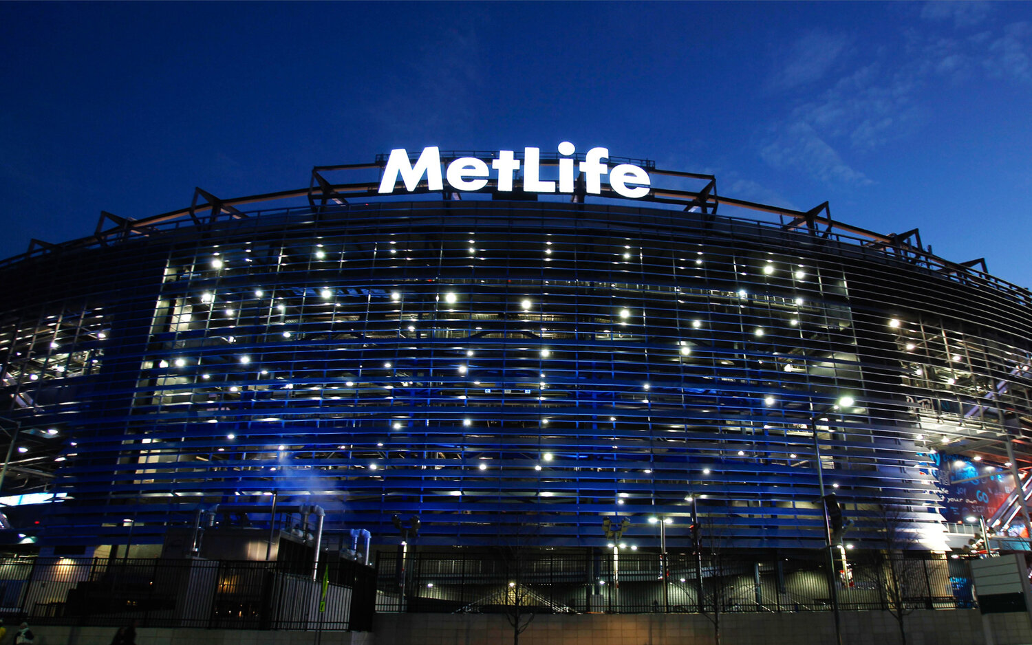
MetLife Central is a fully integrated stadium experience featuring multiple interactive engagements, a central online hub for fans, prizes, and an assortment of digital souvenirs all connected through a centralized customer loyalty program.
The experience begins with fans signing up for the MetLife Central card. This card gives them access to the various digital engagements throughout the stadium and automatically enters them into game-day giveaways and other MetLife promotions.
Once registered, fans can enjoy creating sharable pieces of content, winning instant prizes and receiving exclusive deals. Engagements like Game Time Face gives users a chance to show their spirit and create their own fan football card. Or users can predict the outcomes of the game with Snoopy in 4th Quarter Countdown.
The experience also provided fans with maps for way finding, game day schedules, social feeds and much more.
At home or on the move, fans can stay up to date on all things MetLife Central, view other fans content and purchase Giants and Jets tickets through mlc.com.
Year Completed 2010
Role Art Director
Studio SapientNitro
Collaborators MetLife, Hush Studio, Clickspring
Results
1600 Countdown Card signups each game
Thousands of instant winners awarded in-game prizes
Increased social buzz related to the experience
The Ask: How can New Balance deepen the level of engagement between customers and associates?
New Balance specializes in providing customers with personalized service. They take pride in knowing their customers detailed shoe size, usage and orthopedic requirements.
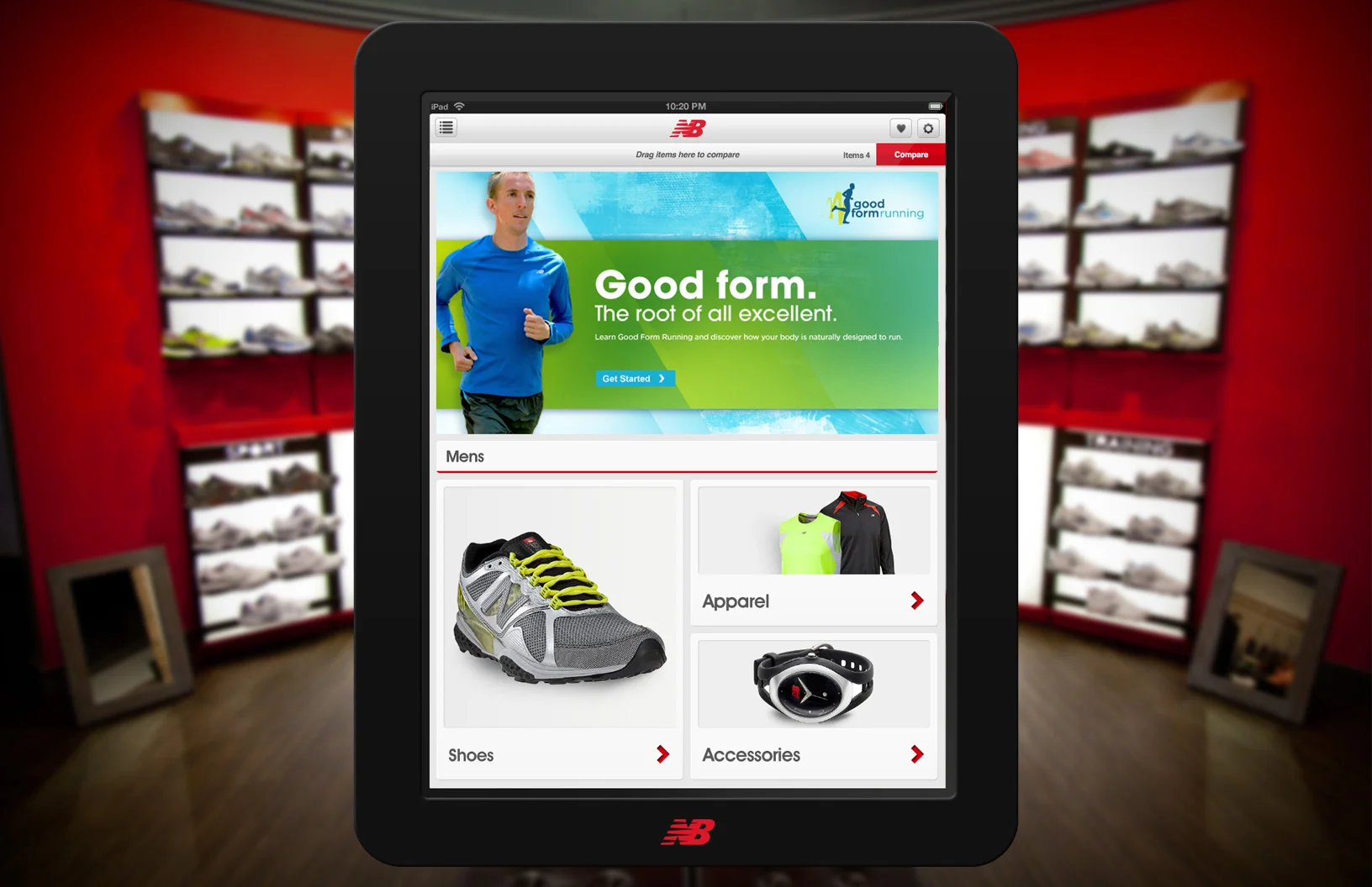
To improve on this service we created an iPad application to enhance the experience of in-store shopping. The app acts as both a point of engagement for self-service and consultative sales interactions.
The application provides sales associates with features and utilities that allow them to assist customers with sizing, product information and comparisons. It also gives them a view into the full set of New Balance products through an online catalog.
Year Completed 2010
Role Associate Creative Director
Studio SapientNitro
Collaborators New Balance, Clean Cut Fabricators
Results
Significant increase in online purchases
Improved CRM
60% Increase in in-store engagement
The Challenge: Design an app for the 21st century Avon lady.
The Avon Brochure App is designed to help you grow and manage your business or shop for your favorite Avon products. Use it to browse brochures anywhere, anytime, and submit or capture orders with the tap of a finger.
Reps can grow and manage their business, access all of their brochures at home or on-the-go. Reps can easily capture multiple customer requests, add new customers on the spot, and help existing customers find them by opting-in their public profile. Customers can shop the latest products on the go and submit wish lists to Avon sales reps.
Year Completed 2013
Role Creative Director
Studio SapientNitro
Collaborators Avon